Did You Know We Are Mapping Our Journey?
Introducing the Map
Maybe you noticed it. Maybe you glided right past it. But the Slow Camino blog has an interactive map! It’s been there the whole time. You can access it from the home page by scrolling down.
Until now, I hadn’t promoted it. We were moving slowly at the beginning, so it wasn’t that interesting and didn’t get updated often. But now that we’re on the move! (In the past week we completed four AirBnB and booking.com stays in three countries.) So I wanted to offer this alternative way to track our journey.
While we will continue to write longform posts about our travel experience, the map provides a more visual and convenient way to see where we’ve been. Also, there is the hard reality that we can’t possibly write a thousand-word essay about every place we visit. The map fills that informational gap with the equivalent of a thousand words — pictures!
How to Use It
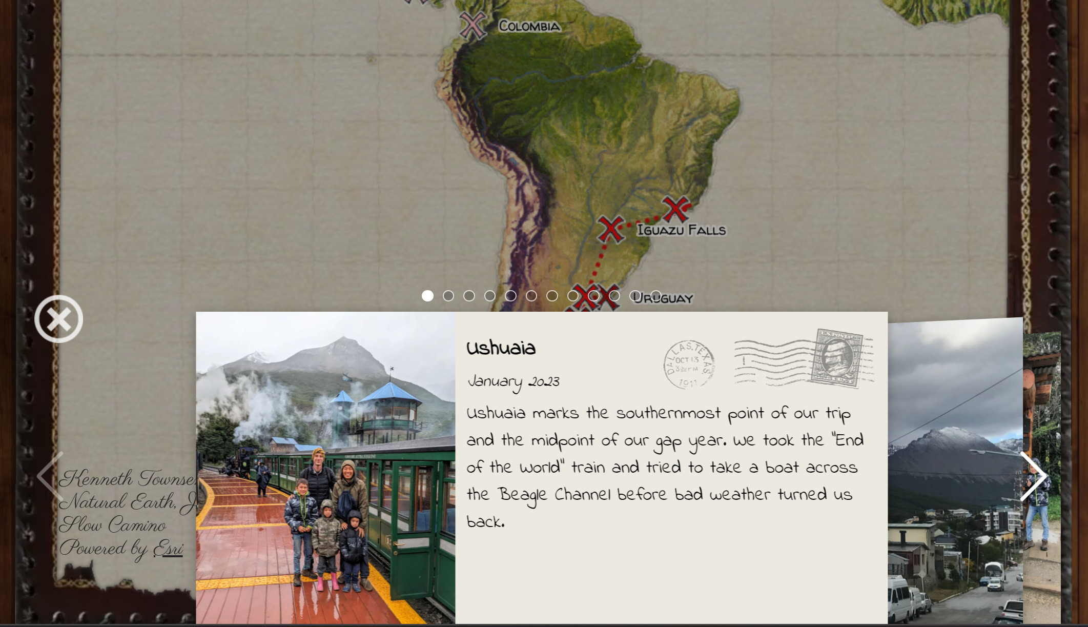
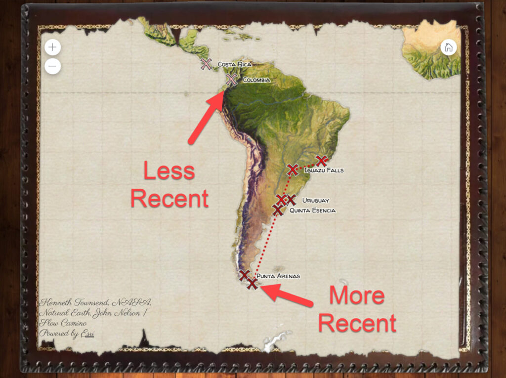
There’s not much to it. When the map loads, you’ll see where we’ve been. Darker red indicates a more recent visit. Lighter pink is from a while ago.
Click on a marker and a slideshow appears. The first slide is always a postcard with a brief description, a link to a full article, or both. Click the arrows or swipe left to see the other pictures in the slide deck.
If you see the “Fly To” button, that means I logged a lot of places close together. Clicking the button will zoom you in so you can see all the markers in that smaller region.
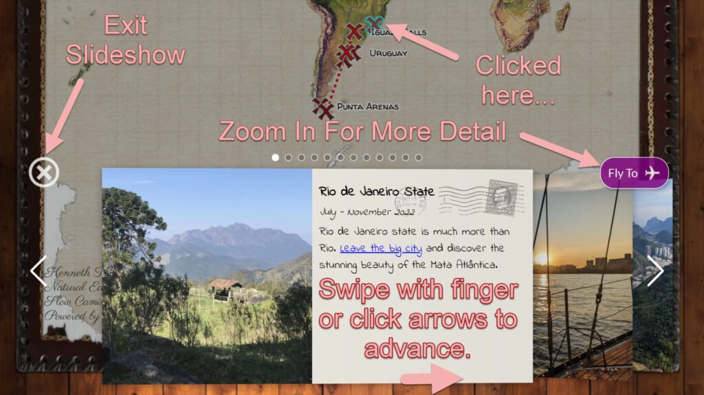
The first slide is always a post card with a brief summary and maybe a link to an article if we wrote one.
More About the Map (For Nerds)
If you are wondering which wicked WordPress plugin I used to generate those graphics, you’ll never find it. It doesn’t exist. I made it myself by cobbling together a few plugins and then coding the rest myself in PHP and the Angular framework. Visualizing information with web-based maps was and is my career.
I had fun with it. Being outside of a professional context allowed me to be playful and weird. The effect I was going for was a tattered vintage-style map laid out on a desk in the captain’s quarters of an old pirate or explorers’ ship.
For practical reasons, not every latitude and longitude we’ve graced with our presence is included on the map. Some places include pictures from more than an hour away. The lines between markers are straight and don’t reflect the actual path we took. These were practical omissions that served to keep it simple so we could enjoy our time on the ground rather than becoming full time cartographers.
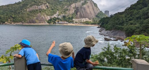
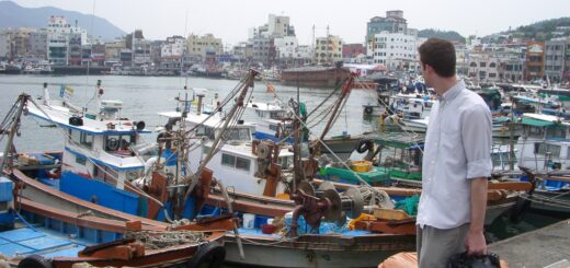
As a rule of thumb, markers are placed in the locations where we booked lodging. Photos from day trips get included in the slides. I also included other trips we took before our South American gap year, which you’ll see them if you zoom out.
Credits
I just wanted to give special thanks to the makers of the Custom Post Type UI and Advanced Custom Fields plugins. That saved me A LOT of time by allowing me to use WordPress to log, find, and edit the map markers through the dashboard rather than having to create my own database.

Written and illustrated by the authors of this blog.
A Book for Little Travelers
A True Story From Our Gap Year